Mei Jing Mei Jing
PROPERTY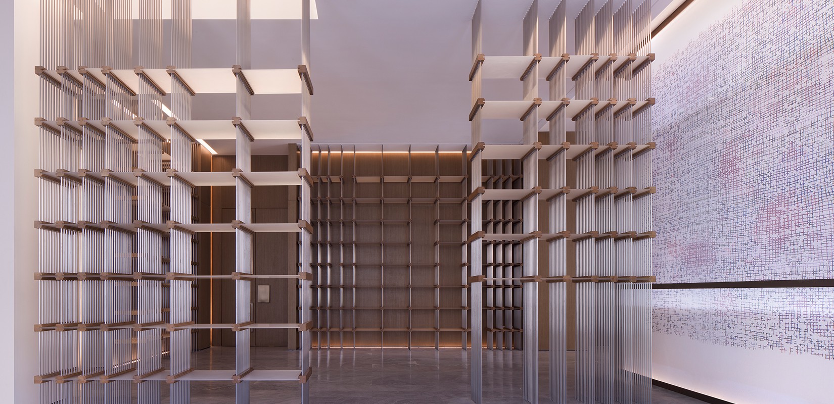
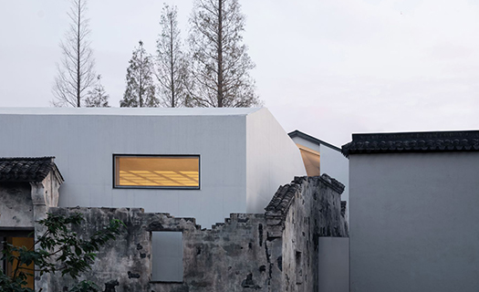
The design of Mei Jing Mei Jing is completed in a restrained and quiet manner. Architect Mr. Kris Yao uses gray bricks and black tiles to pay a tribute to the traditional architecture, and uses construction and the interweaving of building blocks to express the current ideology.
The continuous tiles form the existing roof and have the orderly beauty of traditional Chinese villages. The bricks own a rough texture, and the way they are arranged is rich in layers and full of changes, allowing the confrontation between the thick and the agile to show.
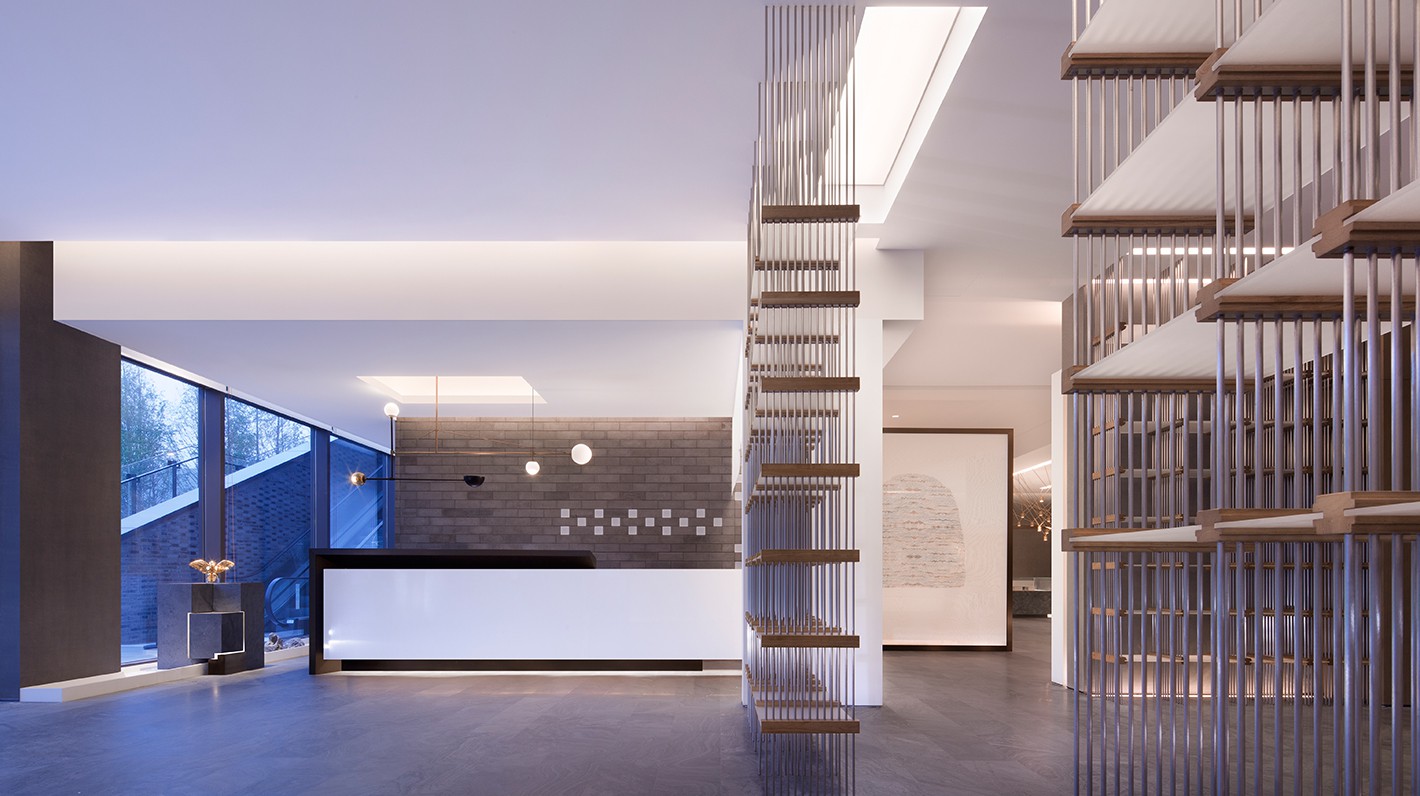
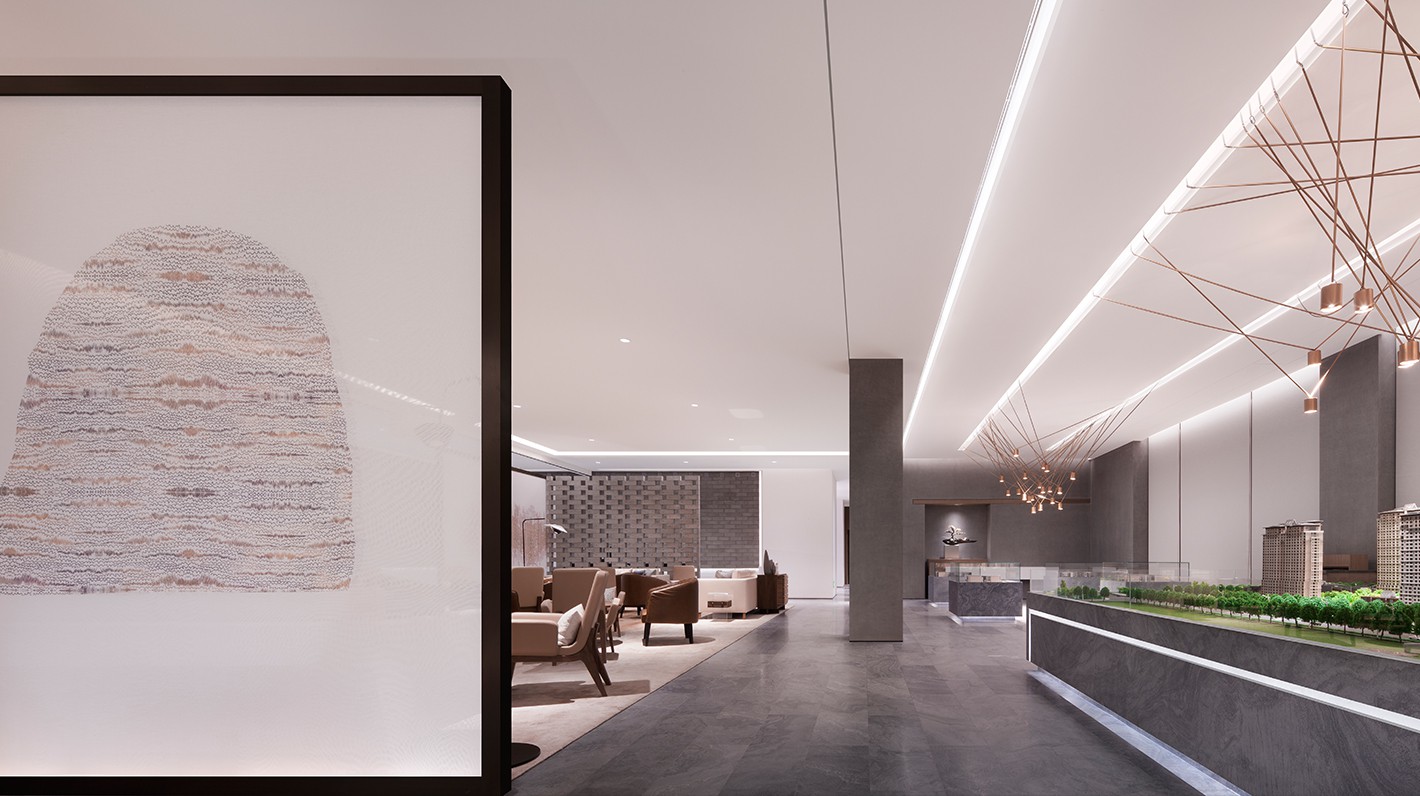
Entering from the entrance, the gray color of the building continues inside, blurring the boundaries between the architecture and the interior.
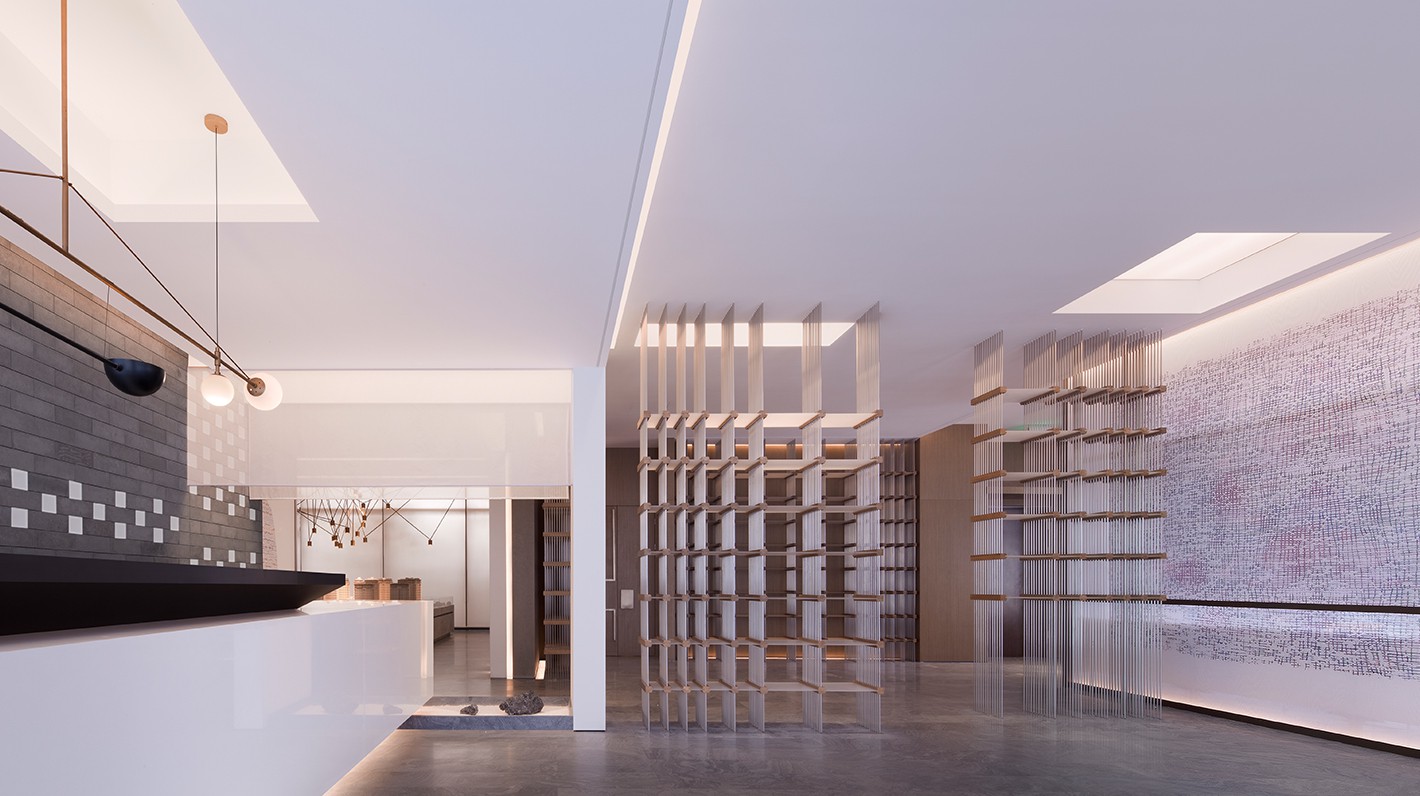
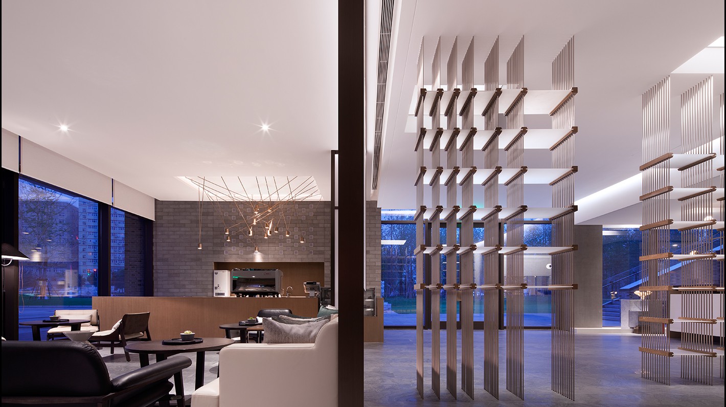
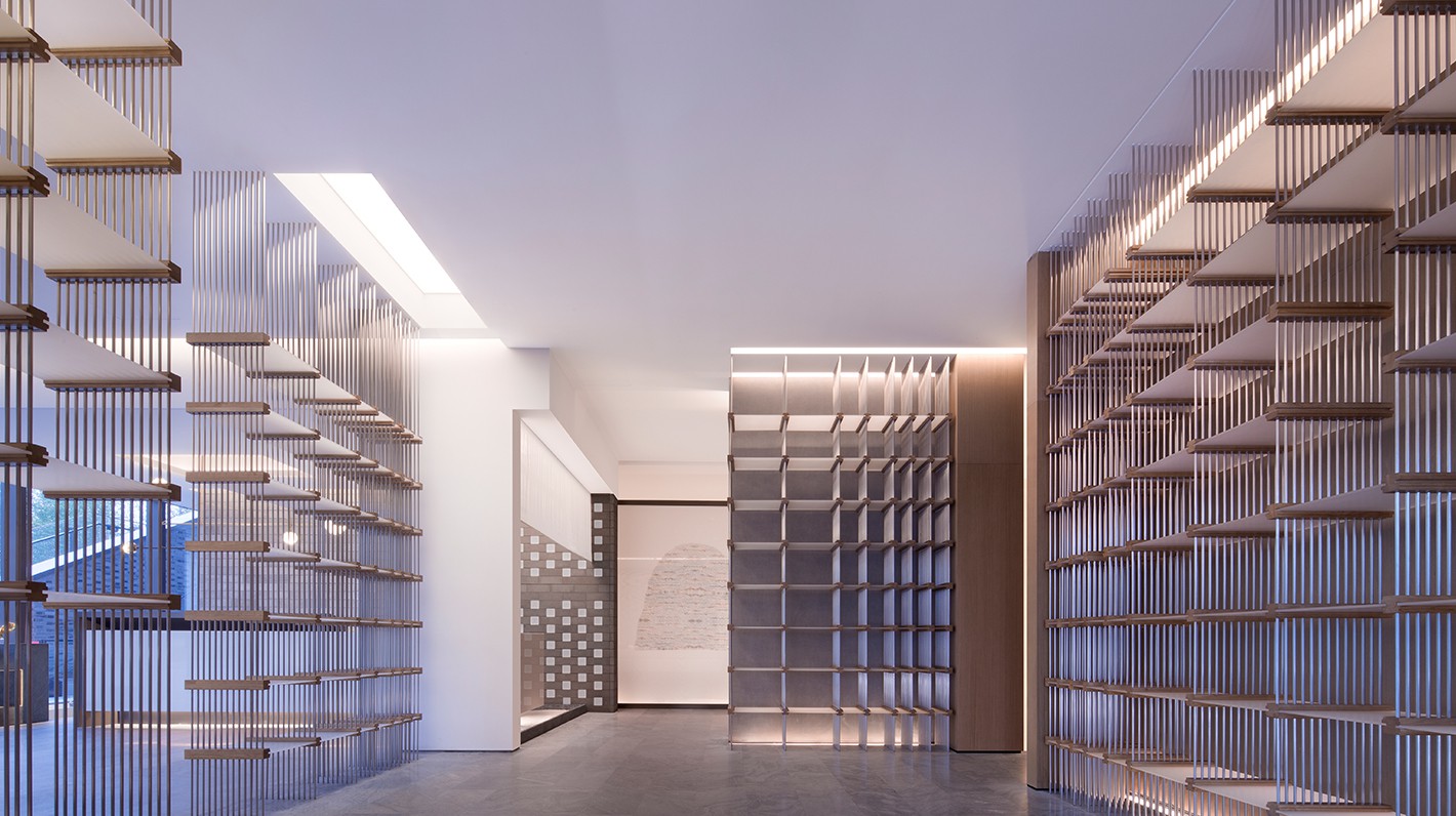
The space faintly captures the oriental charm, but also looks like an impressionism masterpiece. It brings whitespaces to the retelling of modernity. The order of the gray bricks blends with the building and seems to respond to the traditional villages. The semi-transparent spun silk defines the space, revealing the light and the air, and serves as a carrier to depict the linear art pattern. The ground stone, like ink stained on a painting, has a mountain and water scenery-shaped texture that corresponds well to the gray color of the walls. At the border, there is a metal acrylic book shelf, through which the far end could be seen.
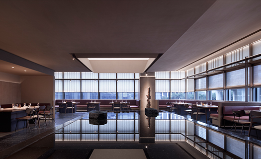
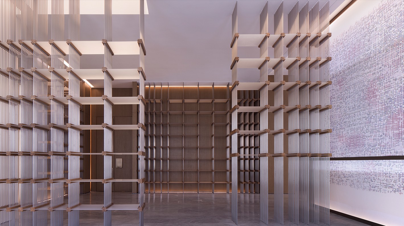
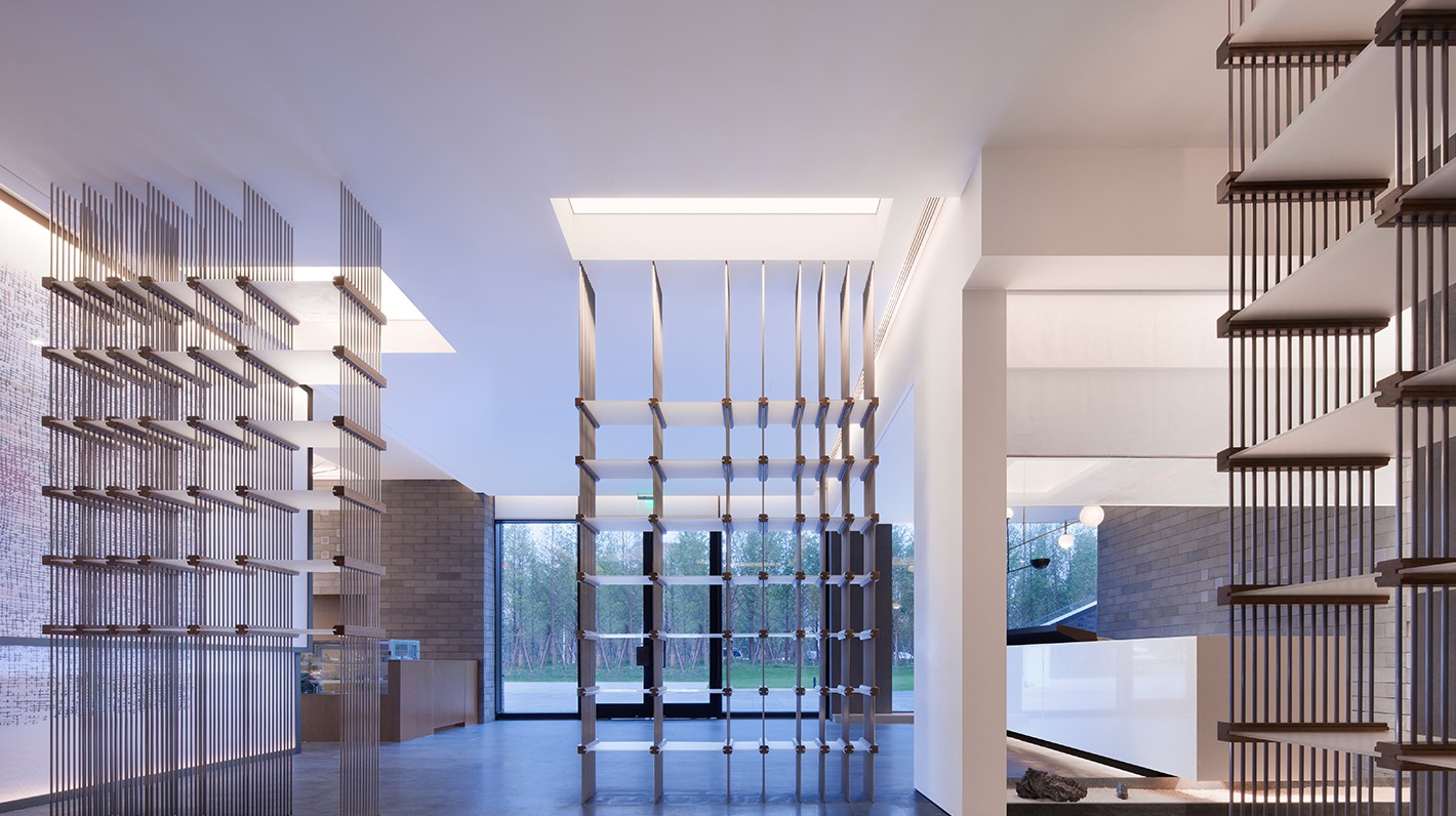
The light flowing into the space is soft. It enters from the gaps above, and changes subtly to cast a soft radiance. The book shelf serves as a transition area, from where different parts of the space could be seen. A café is hidden on the right side. The whispers of the guests and the aroma of roasted coffee beans pass through the spun silk screen, bringing a beautiful feeling that have real temperature. The audio-visual room is located directly in front of the space. The concrete structure forms a rhythm through a hierarchical arrangement, interlaced with linear lights.
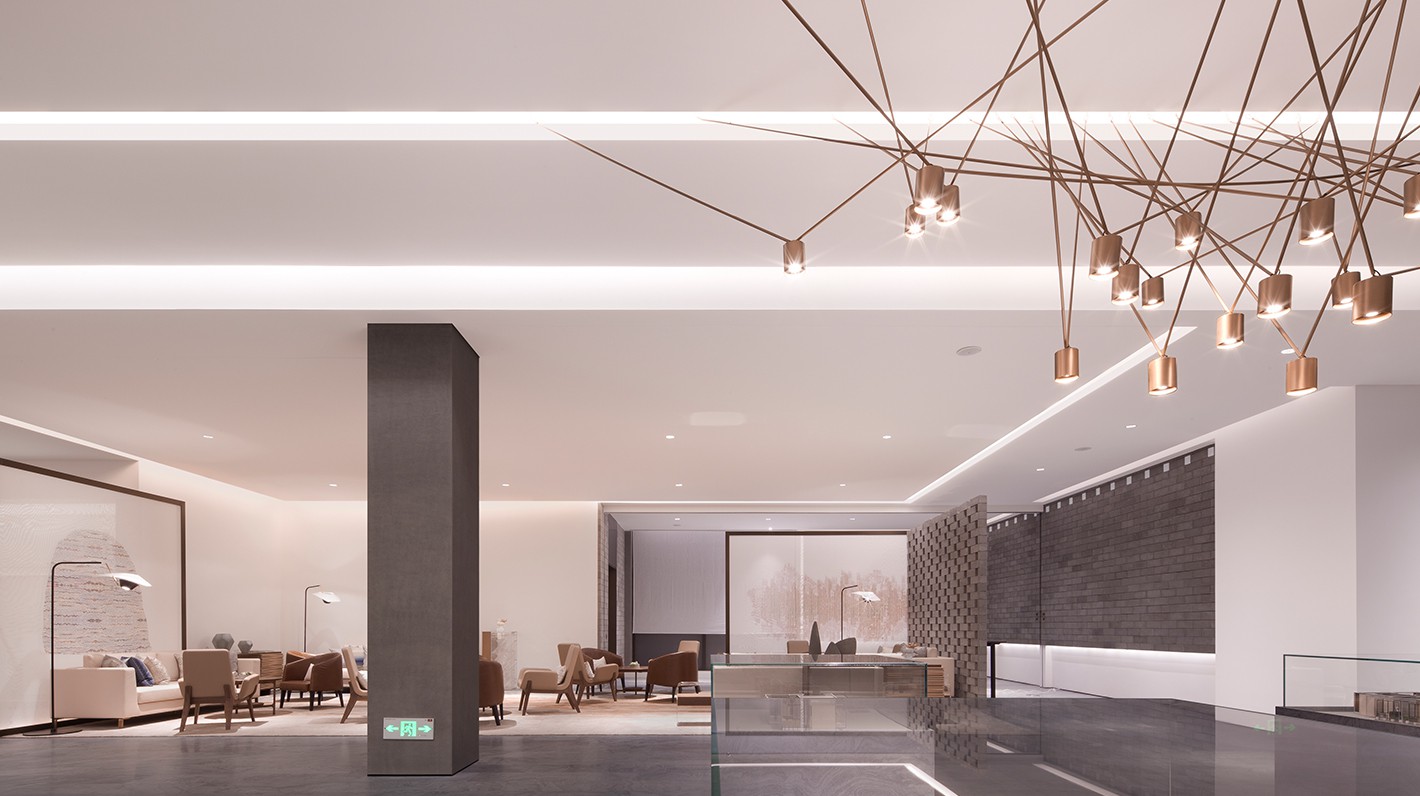
The reception area is separated from the model area by a screen. The right side is like a traditional Chinese ink-wash painting while the left is the ‘whitespace’. Gray stone and bricks form a dialogue with geometric construction technique and the modernity. Clean walls correspond to the negotiation area. The comfortable sofa combination achieves balance in a light space atmosphere. Hollow brick walls and spun silk screen allow two different types of translucent materials echoing each other.
There is no obvious order and law in the space, but the organic balance and symmetry are vaguely reflected. One could discover interlocking art forms in the rich and interesting space and feel the constant charm flowing in the changing space through the guidance and suggestion of the line of sight, through the guidance of sight by hidden and revealing elements.
Concrete, stone, paint, spun silk, wood, copper... These materials are the carriers to express the space. With multiple layers of design and the flowing air and light exaggerating the atmosphere, the space becomes worthy to appreciate.
The lights are customized. With geometric point and line and the balanced combination, their shapes are unconventional but consistent with the circumstance, making the space vivid and interesting.
By so far, this project is just a prelude. The second floor which shows the development and the climax of design is not yet completed. However, in this context, it is possible to glimpse the subsequent creation. Let us look forward to it.