Color Construction
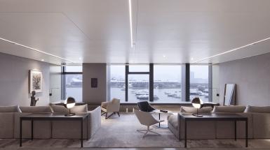
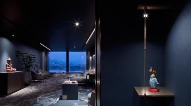
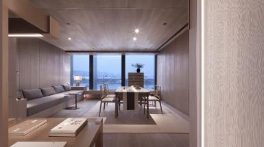
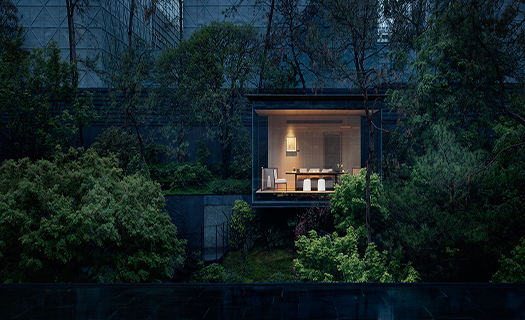
COMMERCEThe natural condition of the site is superior, with a large window facing the sea and reflecting the sky. Yachts park alongside the adjacent dock, seemingly moving. Feng Shui and the development of things, at many times, interact each other as both cause and effect. The location suits the nature and the industry status of the club so well that the beauty of the scenery is just an extra bonus.
The theory of relativity lies in everywhere, such as the movement, the distance, and the time, etc. The unified floor height of offices in Hong Kong is no exception. Similar passages and color tone of the exterior create a sense of depression, but they also highlight the uniqueness of interior.
This is a new attempt. There are two sets of logical systems lying in the design thinking process: using colors to construct the ambience in the space and guiding visitors’ emotions through environment to achieve certain sensory effects.
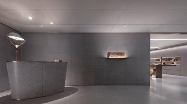
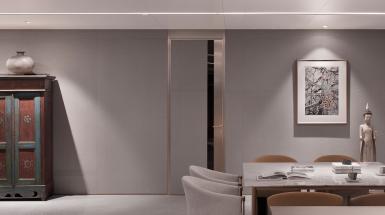
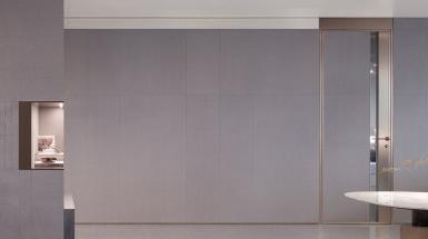
Beige is chosen for the two reception halls. Anyone enters here could sense its cleanliness and simplicity. Terrazzo wall and floor go well together with the irregular-shaped reception desk, and the lamp is a finishing touch in the room. The whole space is filled with elegance, tranquility, and delicacy, building up a soothing atmosphere that most people could accept. One would easily calm down in the space and feel comfortable either standing up or sitting down, staying still or walking around.
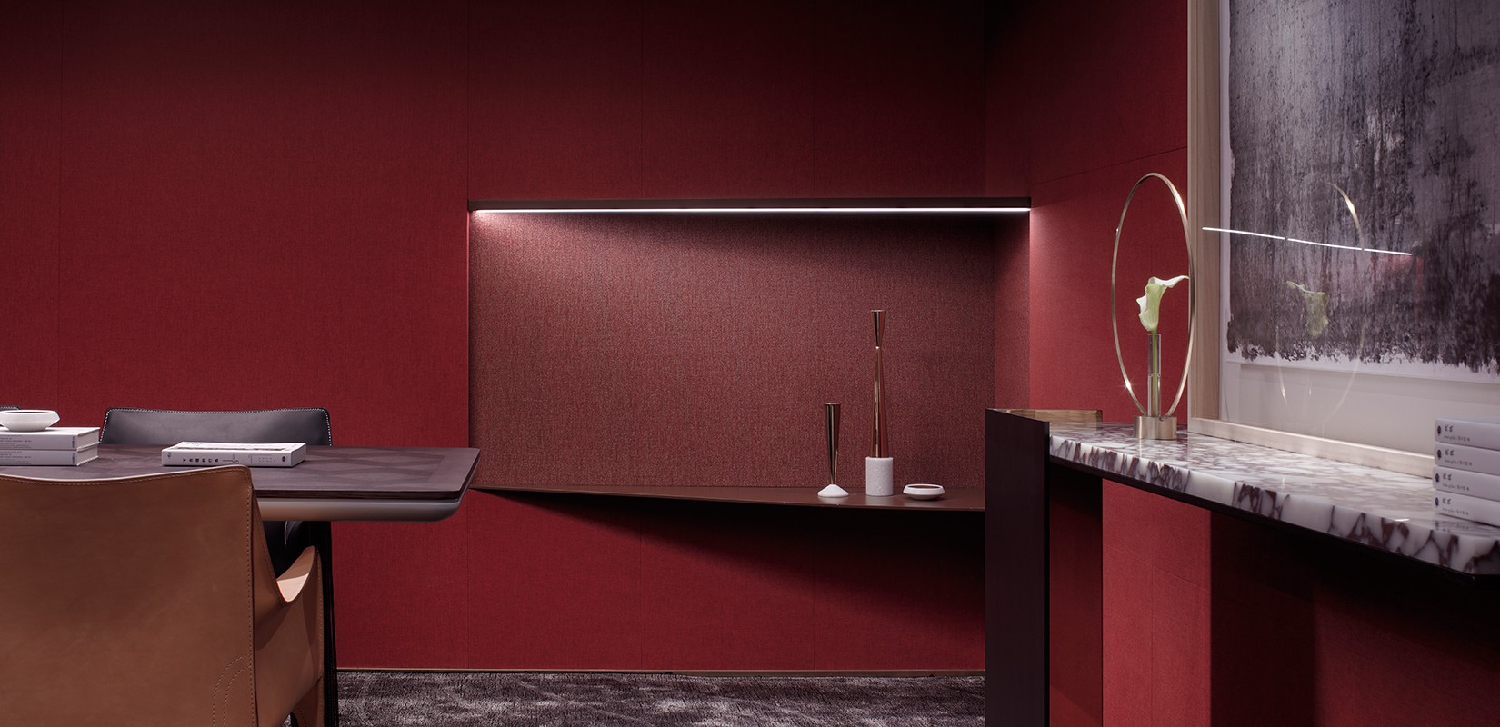
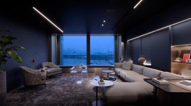
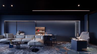
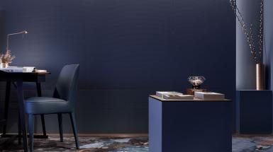
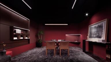
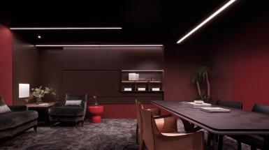
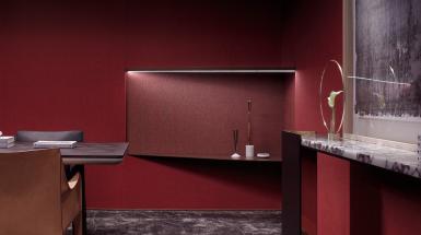
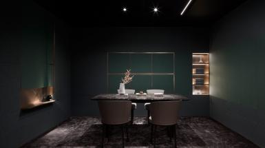
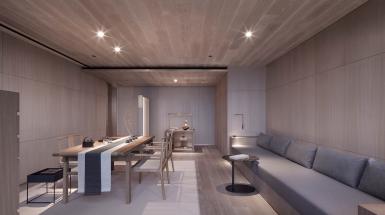
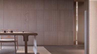
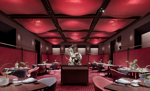
The other system is not just about distinguishing colors. Blue, green, red, and wooden... different colors are used in various function spaces. Although one’s feeling might not be completely altered by the change of colors, it could be adjusted accordingly to some extent.
All design in the public spaces serve the purpose of making people willing to stay . The different applications of color construction in the private spaces, meanwhile, aim to evoke one’s emotions and feeling to memorize the experience.
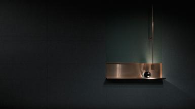
Copper is used for the detailing of all the variances, colors, and function spaces. It acts as the skeleton of the whole project. Then a unified temperament and harmonious feeling is created.
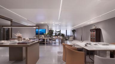
A very important part in the space, the ceiling, is done in the simplest way. The material is expected to reflect light in a way that is uneasy to detect. With more subtle displays on it, the scale of the space feels larger.
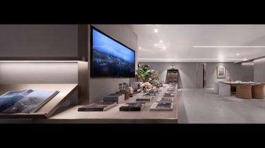
The material used for the ceiling is powder coated panels, with a 50% level of matte ness. Linear lights are adopted in the space because they help enhance the texture, act as adornments while satisfying basic functions, and echoes the components that are relevant to the yacht.
Thanks to the super yacht that will be launched in August, we have become experienced in dealing with the design and creation of atmosphere in this kind of small space. I utilized these experiences treating the ceilings and walls, including the application of air conditioning outlets.
During the whole process, I was deeply moved by our general contractor, who is probably the best during my more-than-twenty-year career in the industry. They paid extremely high attention to their organization and construction details. Their understanding towards the joints and redesign of them inspired me a lot. It is no always easy to find a good construction team like them. My ideas are well executed, making the current presentation of the project possible.
The concept of bringing up various psychological feelings through the utilization of colors is not only the origin of the project name, but also the most concise interpretation of it. I will continue to work on color construction for a while.
